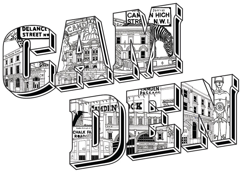
As an illustrator, the art of visually narrating stories has always been a fascinating endeavour. Recently, I embarked on a creative journey delving into a distinctive medium: postcard-style typographic city illustrations. Join me as I guide you through my exploration of Camden, where I utilised the power of typography to encapsulate the timeless charm and distinctive character of this iconic borough.
The Vision: Typography as a Creative Medium
This creative odyssey began with a clear vision – the intent to convey Camden's quintessential charm through the art of typography. Choosing a classic black and white color palette, my aim was to evoke sophistication and nostalgia, aligning with the borough's iconic landmarks and cultural symbols.
The Creative Process: Camden Woven into Every Letter
The enchantment of this project lay in the meticulous detailing within each letter that collectively spelled "Camden." Each letter transformed into a canvas, encapsulating the borough's most cherished locations and cultural treasures:
- The “C” was dedicated to the iconic Hawley Arms, a beloved pub that has witnessed countless moments of laughter and music.
- The “A” celebrated Koko, a renowned music venue that has hosted legendary performances over the years.
- The “M” showcased the Dublin Castle Tavern, a historic hub for live music and artistic expression.
- The “D” represented the iconic Roundhouse, a venue that has seen the likes of Pink Floyd and Jimi Hendrix grace its stage.
- The “E” was dedicated to Camden Town Station, the bustling heart of the neighbourhood.
- The “N” paid tribute to the Jazz Cafe, a musical institution that continues to delight audiences with its eclectic performances.
The Final Artwork: A Postcard Reflecting Camden's Creative Spirit
The completed typographic illustration transcended its role as artwork; it transformed into a heartfelt love letter to the Borough of Creativity. Within its lines, it captured the very essence of Camden – its artistic flair, cultural diversity, and unapologetic celebration of individuality.
In conclusion, typographic city illustrations offer a unique avenue for immersing viewers in the soul of a place. Camden, with its iconic landmarks and cultural symbols, served as the perfect muse for this project. It highlights the power of art to transport us to different realms and convey a location's essence. Through this typographic postcard, I hope you can savour a slice of Camden's enchantment and allure, no matter where you are.